This guide breaks down 12 exit-intent popup patterns that work across ecommerce and lead generation. No invented case studies and no fake conversion claims here — each pattern comes with the headline formula, the offer type, why it works, who should use it, and a visual example.
How exit intent actually works (and its limits)
On desktop, exit-intent technology watches the cursor. When a visitor’s mouse accelerates toward the top of the browser window — heading for the close button, the tab bar, or the address bar — the popup fires. It’s a prediction, not mind-reading: fast upward movement usually means “I’m leaving.”
- Mobile has no cursor. On phones and tablets, exit intent is approximated with signals like the back button, rapid scrolling up, tab switching, or inactivity on a checkout page. Good popup tools support these fallback triggers — make sure yours does.
- Timing beats design. A beautiful popup shown to everyone after five seconds is an interruption. The same popup shown once, at the moment of leaving, is an offer. Frequency capping (once per session) matters more than your color scheme.
- The offer must match the exit reason. People leave product pages for different reasons than they leave checkout pages. A discount might fix price hesitation; it does nothing for someone who couldn’t find their size.
The 12 exit-intent popup patterns
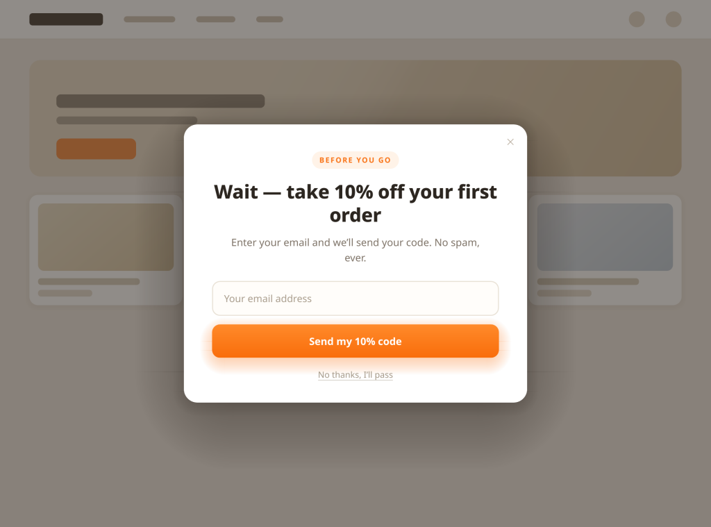
1. The straight discount
- Headline formula: “Wait — take 10% off your first order”
- Offer type: Percentage or fixed-amount discount code in exchange for an email address
- Why it works: Price is the most common silent objection. A modest discount at the exact moment of leaving reframes “not now” into “cheaper now,” and collecting the email keeps the relationship even if they don’t buy today.
- Who should use it: Almost every store, as a baseline. It’s the pattern to beat in your A/B tests. Keep the discount small enough that you’re not training visitors to abandon on purpose.
2. The free-shipping save
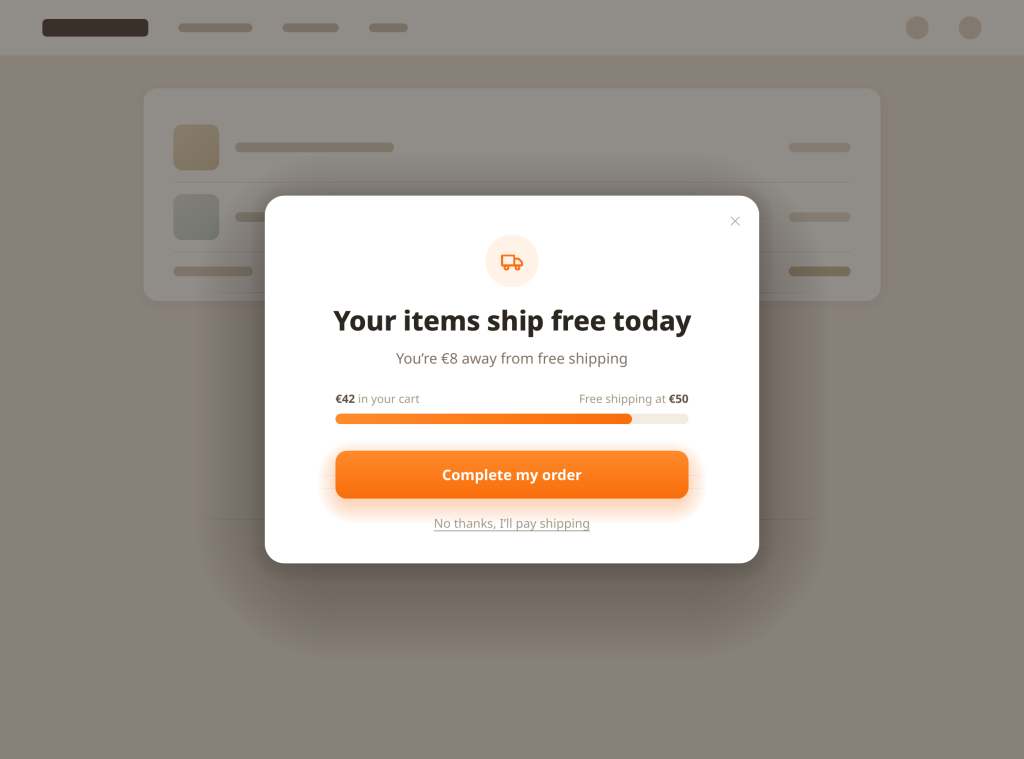
- Headline formula: “Your items ship free when you complete this order”
- Offer type: Free shipping threshold or free shipping code
- Why it works: Unexpected shipping costs are the classic checkout killer. Removing that friction at exit often converts better than an equivalent product discount, because it removes a surprise rather than discounting the product.
- Who should use it: Stores that charge for shipping, especially with carts near a free-shipping threshold. Show how close they are: “You’re €8 away from free shipping” beats a generic offer.
3. The two-question diagnostic
- Headline formula: “Not finding what you need? Answer 2 quick questions”
- Offer type: A short quiz that ends in a product recommendation or a tailored email signup
- Why it works: Many exits aren’t price problems — they’re fit problems. A two-tap diagnostic (“What are you shopping for?” → “What’s your budget?”) converts confusion into a recommendation, and the answers double as segmentation data for your email list.
- Who should use it: Stores with large or technical catalogs — supplements, skincare, electronics — where visitors leave because they couldn’t decide.
4. The lead magnet swap
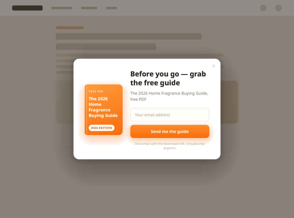
- Headline formula: “Before you go — get the free [guide/checklist] our customers use”
- Offer type: Downloadable content (buying guide, size guide, care guide, checklist) in exchange for an email
- Why it works: Not every visitor is ready to buy, but many are ready to learn. A useful guide captures the email, positions your store as the expert, and gives you a nurture sequence to run.
- Who should use it: Considered purchases, anything with research involved. If your buying guides get traffic, this pattern monetizes it.
5. The cart mirror
- Headline formula: “You left these behind”
- Offer type: A visual reminder of the exact items in the cart, with a one-click return to checkout
- Why it works: Sometimes the exit is pure distraction — a notification, a doorbell. Showing the actual products (image, name, price) reactivates the original intent far better than a generic “come back!” message.
- Who should use it: Any store with a cart. This should be your default cart-page exit popup before you reach for discounts.
6. The reassurance popup
- Headline formula: “Shop with confidence: free returns, secure checkout”
- Offer type: No discount — trust signals only: your real return window, warranty, payment security, and genuine review counts
- Why it works: First-time visitors often leave because buying from an unknown store feels risky, not because of price. Your actual guarantees, shown at the decision moment, address the real objection — without giving away margin.
- Who should use it: Newer stores and higher-ticket items. Use your real numbers — actual review count, rating, return period. Invented social proof destroys the trust this pattern builds.
7. The honest stock note
- Headline formula: “Heads up: only a few left in your size”
- Offer type: Real inventory information about items the visitor viewed or carted
- Why it works: Scarcity focuses attention — but only when it’s true. If your inventory feeds real stock levels into the popup, this converts hesitation into a decision. Fake it, and visitors learn to ignore you.
- Who should use it: Stores with genuinely limited runs — fashion sizes, small-batch products, seasonal stock. Only deploy it if the numbers are live and accurate.
8. The objection handler (chat handoff)
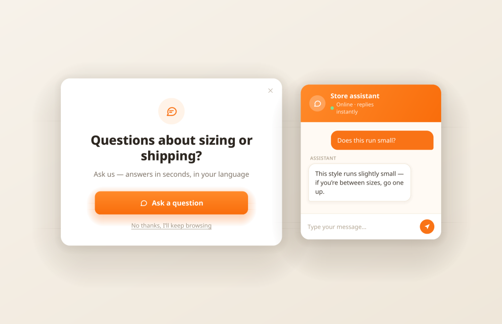
- Headline formula: “Questions about sizing, shipping or returns? Ask us — it takes a second”
- Offer type: An instant answer channel: AI chat or live chat opened from the popup
- Why it works: A large share of exits are unanswered questions, not rejections. A discount can’t answer “does this run small?” A chat can. This pattern converts the popup from a bribe into a service desk, and the conversation often closes the sale at full price.
- Who should use it: Stores with question-heavy products — sizing, compatibility, ingredients, setup. In Oscar Chat, the popup and the AI chat are the same widget family, so the “ask a question” button opens a chat that answers in 50+ languages instead of dead-ending at a form.
9. The downgrade offer
- Headline formula: “Not ready today? We’ll let you know when it’s back / on sale”
- Offer type: Back-in-stock alerts, price-drop alerts, or a simple “keep me posted” email signup
- Why it works: It respects the visitor’s actual position. Someone browsing three weeks before payday doesn’t need 10% off; they need a reason to return. A smaller commitment gets a yes where a purchase ask gets a closed tab.
- Who should use it: Stores with stock-outs, seasonal demand, or long consideration cycles. Also a strong follow-up for visitors who already declined your discount popup.
10. The ten-second exit survey
- Headline formula: “Quick one: what stopped you today?”
- Offer type: A one-question survey (too expensive / just browsing / couldn’t find X / shipping / other)
- Why it works: It won’t save this session, and that’s fine. Exit surveys are market research you could never buy this cheaply: a month of answers tells you whether your problem is pricing, navigation, or shipping.
- Who should use it: Everyone, at least periodically. Rotate it in for a week per quarter — one question, tap-to-answer — and actually read the results.
11. The gamified reward
- Headline formula: “Spin to reveal your discount”
- Offer type: Spin-to-win wheel or scratch-card with tiered rewards (small discount, free shipping, a gift)
- Why it works: Variable rewards feel like a game rather than a negotiation, and the store controls the economics through the prize distribution. The interaction itself is the hook, so email capture rates tend to be strong.
- Who should use it: Brands whose tone can carry it — playful, promotion-driven stores. If your brand is premium or clinical, this pattern cheapens it; use pattern 4 or 8 instead.
12. The email-my-cart
- Headline formula: “Email this cart to yourself and pick up where you left off”
- Offer type: Cart contents sent by email (one field, one click)
- Why it works: Device switching is a hidden cause of abandonment — research on the phone, buy on the laptop. This popup makes that journey deliberate, captures the email with clear consent, and the email becomes your first recovery touch.
- Who should use it: Stores with considered, multi-item, or shared purchases (home goods, gifts). Pairs naturally with a cart recovery email flow.
A fill-in template you can copy
Every pattern above uses the same skeleton. Steal it:
- Eyebrow (optional, small): the loss they’re about to take — “Your cart is waiting”
- Headline (one line, benefit or question): “Take 10% off before you go”
- Subhead (one line, removes friction): “Enter your email and we’ll send your code. No spam, ever.”
- Field: one field only — email, or phone if your program is SMS-first
- Button (verb + outcome): “Send my 10% code” beats “Submit” every time
- Decline link (polite, no guilt-tripping): “No thanks, I’ll pass” — dark patterns (“No, I hate saving money”) cost trust
Rules for all 12 patterns: show once per session at most, always with an obvious close button, and suppress for anyone who already converted or already saw a popup this session.
What to test first
You cannot test everything at once, so sequence it:
- Offer before aesthetics. Discount vs free shipping vs lead magnet moves numbers more than any button color. One variable at a time.
- Headline second. The same offer with a benefit headline (“Ships free today”) versus a question headline (“Leaving so soon?”) is a clean test.
- Segment by page. One variant for cart/checkout exits, another for blog/content exits. Your content-page popup should primarily grow your email list; your cart-page popup should primarily save orders. If a cart popup collects emails but saves no orders, its offer is wrong.
- Mobile trigger behavior. Verify what “exit intent” means on phones in your tool, and check the popup is dismissible on a small screen.
- Downstream value, not just popup conversion. A discount popup with a high take rate can still lose money if it subsidizes people who would have bought anyway. Watch margin.
In Oscar Chat’s Popup Builder — free, with exit-intent triggers and A/B testing built in — the workflow is: duplicate your current popup, change one variable, split the traffic, and let the test run until the difference is consistent across weekdays.
Common mistakes that kill exit popups
- Showing it too early. Exit intent firing eight seconds after arrival means your trigger is broken, not that they’re leaving.
- Asking for too much. Name, email, phone, and birthday on an exit popup is a job application. One field.
- The same popup everywhere. A blog reader and a checkout abandoner are different people in different moods.
- No suppression rules. Showing a discount popup to someone who just bought trains visitors to ignore you permanently.
- Guilt-trip decline copy. It converts marginally and embarrasses your brand in screenshots. Don’t.
7-Day Pro Trial for Every New Account
For your first 7 days, you are automatically on the Pro plan.
Start Free with Pro ↗Frequently asked questions
Do exit-intent popups work on mobile?
Not in the cursor sense — phones have no mouse to track. On mobile, good popup tools approximate exit intent using the back button, fast upward scrolling, tab switches, or inactivity on a checkout page. A well-timed scroll or inactivity trigger does the same job: catching the visitor as attention leaves.
How often should I show an exit popup?
Once per session is a sane default, and never again for a visitor who converted or dismissed it recently. Exit popups work because they arrive at a decision moment; repeating them turns a service into harassment.
What conversion rate should I expect?
Aim qualitatively rather than chasing published benchmarks, which usually come from different industries and are rarely honest. A healthy exit popup recovers a small but real share of leavers as email signups and saves a narrower slice as immediate orders. If yours collects emails but never saves an order on cart pages, the offer needs work.
Should I offer a discount in an exit popup?
Only if price is plausibly the objection on that page. On a cart page, try help first — the cart mirror, free shipping clarity, or a chat handoff — and reserve discounts for visitors who still hesitate. Leading with a discount trains visitors to abandon on purpose to trigger it.
Do exit popups annoy loyal customers?
Yes, with segmentation: suppress popups for logged-in customers with recent orders, for anyone who already subscribed, and for visitors who saw one this session. The goal is catching first-time leavers, not taxing loyal buyers with interruptions.
Which tool should I use for exit-intent popups?
Any builder with real exit-intent triggers, mobile fallbacks, frequency capping, and A/B testing will do. Oscar Chat’s Popup Builder covers all of those and is free, with a free plan to start and paid plans as you grow — current prices are on the pricing page. For a broader comparison, see our popup builders compared breakdown and our guide to what free popup builders actually get you.
The bottom line
Exit-intent popups aren’t magic; they’re timing plus relevance. Pick the pattern that matches why your visitors leave, write the headline in their words, ask for one thing, and test the offer before the design. For saving carts specifically, continue with Cart Abandonment Popups: How to Win Back Shoppers Who Are About to Leave.