
A cart abandonment popup is your chance to fix that something before they leave — or to capture a way back if you can’t. This guide covers which abandonment reasons a popup can actually address, the three moments worth intervening, a help-first offer ladder that protects your margin, and copy templates you can adapt today.
First, honesty about why carts get abandoned
Not every abandoned cart is a failure. Some shoppers were never buying today: they’re comparing prices across stores, building a wishlist in the wrong place, or checking whether a discount code exists. No popup fixes “just browsing,” and trying to discount your way into those shoppers’ wallets just burns margin.
The abandonment reasons a popup can fix:
- Surprise costs. Shipping fees, taxes, or minimum-order rules that only appear at checkout. Fixable with clarity — sometimes just surfacing the total cost earlier, or a free-shipping threshold reminder.
- Unanswered questions. Sizing, compatibility, delivery times, returns. The shopper isn’t rejecting your product; they’re stuck. A discount does nothing here. An answer does everything.
- Distraction and device-switching. Real life interrupts checkouts constantly. The fix is a bridge back: email-my-cart, or a saved-cart link they can open anywhere.
- Payment friction and hesitation. Unfamiliar checkout, no preferred payment option, or simple second thoughts at the total. Reassurance (returns, guarantee, secure payment) addresses the emotional side; it can’t add a payment method you don’t offer.
- Genuine price hesitation. The one reason a discount actually solves — which is why it belongs last in your ladder, not first.
Your popup strategy is a matching exercise: show the intervention that fits the reason. Everything below is organized around that idea.
The three moments worth intervening
Moment 1: The quiet stall on the cart or checkout page
The tab has been open, nothing has happened for a while, or the shopper has scrolled up and down the checkout without progressing. Inactivity and hesitation triggers catch this moment. The right move is help, offered quietly: “Need a hand? Questions about delivery or returns — ask us here.” This is where a chat handoff shines: one unanswered question resolved in the moment is worth more than any discount code.
Moment 2: Exit intent with a full cart
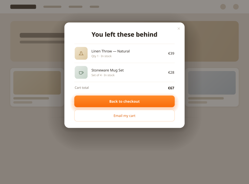
The classic case: cursor heading for the close button (or the mobile equivalents — back button, rapid scroll-up, tab switch) while items sit in the cart. This popup has one job: remove the reason, or capture the way back. Start with the cart mirror — show the actual items — then layer the fix: free shipping clarity if shipping is your friction, the chat handoff if questions are, email-my-cart if timing is.
Moment 3: The return visit that doesn’t convert
A shopper came back from a recovery email, browsed, and is leaving again without buying. They’ve now told you twice that something is wrong. This is the moment a survey earns its place (“What stopped you?”) — or, if their cart is still full and price was flagged before, the one moment a modest incentive is justified.
What you should not do: popup on arrival, popup on every page, or popup at the moment they’re typing payment details. Interventions belong at decision points, not sprinkled over the whole session.
The help-first offer ladder
Run your cart popups in this order. Each rung catches the shoppers the previous one couldn’t, and the cheap fixes come before the expensive ones.
Rung 1 — Answer. “Questions about sizing, shipping or returns? Get an instant answer.” Opens your AI chat or live chat. Costs you nothing per save, works at full margin, and handles the single most fixable abandonment cause. In Oscar Chat this is one widget flow: the popup’s button opens the AI chat, which answers product and policy questions in 50+ languages around the clock — including at 2 a.m., when a large share of distracted-shopping carts are built and abandoned.
Rung 2 — Remind and reassure. The cart mirror with your real guarantees attached: “Your cart is saved. Free returns within [your actual window], secure checkout.” Removes risk anxiety without touching price.
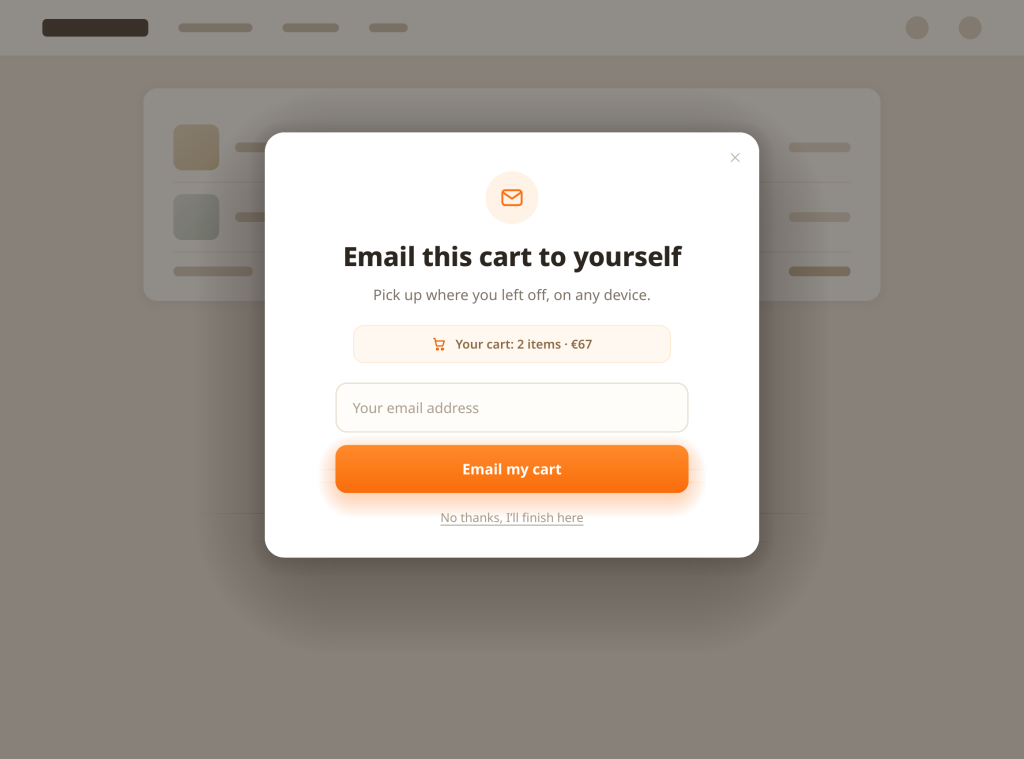
Rung 3 — Bridge back. “Email this cart to yourself.” One field. The shopper leaves with a link that restores the exact cart on any device — and you have a consented email address for a proper recovery sequence.
Rung 4 — Incentivize, narrowly. A modest discount or free shipping, shown only to segments where price is the plausible blocker: first-time visitors with high-value carts, or return visitors who browsed pricing pages. Never site-wide by default; a discount everyone can trigger is just a permanent price cut with extra steps.
In practice, you implement this as segmented popups, not one mega-popup: one for checkout stalls (rung 1), one for exit intent with a cart (rungs 2–3), one tightly-fenced incentive variant (rung 4). In a builder like Oscar Chat’s — free, with exit-intent triggers and A/B testing — that’s three popups with audience rules, not three tools.
Copy templates by scenario
Adapt these; they’re written to be edited, not worshipped.
Scenario: checkout stall, help offer
Stuck on something?
Sizing, delivery times, returns — ask us anything and get an instant answer.
[Ask a question] · [No thanks, I’m fine]
Scenario: exit intent, free-shipping clarity
Before you go — your order ships free
You’re over our free-shipping threshold. Complete your order and shipping is on us.
[Back to checkout] · [I’ll pass]
Scenario: exit intent, cart mirror + bridge
Your cart misses you already
[item image] [item name] — still reserved for you.
Email it to yourself and check out whenever you’re ready.
[email field] [Email my cart]
Scenario: exit intent, reassurance (first-time visitor,
high-value cart)
Shop with confidence
Free returns within [X] days, a [Y]-year warranty, and secure checkout. Your cart stays saved while you decide.
[Continue to checkout] · [Keep browsing]
Scenario: fenced incentive (price-hesitant segment only)
Here’s a little nudge: 10% off, today only
Use it now or lose it — your code appears after you enter your email, and it applies to this cart.
[email field] [Send my code]
Notice what every template shares: one idea, one action, one field maximum, and a decline option that doesn’t insult the visitor. (“No, I don’t like saving money” is a dark pattern; it also tends to be screenshotted.)
Pairing popups with recovery emails
The popup is the save you attempt in-session. The email flow is the save you attempt after. They work best as a relay:
- The popup captures the baton. Email-my-cart and alert signups give your recovery emails a consented address and a reason to exist. A shopper who asked for their cart by email is expecting your message — that’s the highest-quality recovery email you’ll ever send.
- The first recovery email stays a reminder, not a bribe. “Your cart is saved” with the items, the total, and one clear button. If your store connects to an email platform — Oscar Chat integrates with Klaviyo, for instance — the cart contents and signup source can flow into the same audience your campaigns already use.
- Escalate information before incentives. Email two answers your store’s most common objection (shipping times, returns). Email three is where a modest incentive belongs if price data says it’s needed. Shops that lead with a discount in email one train subscribers to abandon on purpose.
- Feed the results back. Which popup variant captures the most emails? Which recovery email actually gets the orders? Test popup offers against each other with A/B splits, and let the recovery data — not the popup’s raw take rate — judge your discount variants. A discount popup that “converts” by emailing codes to people who never buy is a cost, not a win.
Segmentation rules that protect your margin
- Exclude anyone who already purchased this session. Showing a discount popup after checkout is a pure loss and looks broken.
- Suppress recent dismissers. Someone who closed your popup twice today has voted. Respect it for at least the rest of the day, ideally longer.
- Fence the discount by intent signals. High cart value, first visit, pricing-page browsing — pick signals that actually suggest price sensitivity in your store, then verify with a holdout test rather than assuming.
- Cap frequency ruthlessly. One cart popup per session. The second showing almost never converts someone the first showing annoyed.
- Mind the mobile experience. Test every template on a real phone: close button reachable with a thumb, field usable without zooming, no layout shift that moves the checkout button. Most of your carts are mobile; your QA should be too.
7-Day Pro Trial for Every New Account
For your first 7 days, you are automatically on the Pro plan.
Start Free with Pro ↗Frequently asked questions
What’s the difference between a cart abandonment popup and a recovery email?
Timing. The popup intervenes while the shopper is still on your site — at a stall, a hesitation, or the moment of exit. The recovery email works after they’ve already left. The popup is your chance to fix the problem; the email is your second chance to be remembered. Used together, the popup also captures the email address that makes the recovery email possible.
Should I always offer a discount in my cart popup?
No — it’s the last rung of the ladder, not the first. Lead with help (a chat handoff for unanswered questions), reassurance (returns, guarantees), and the email-my-cart bridge. Reserve discounts for segments where price is the demonstrated blocker. Stores that open with a discount train visitors to abandon carts deliberately to trigger it.
When exactly should a cart abandonment popup trigger?
At decision points: exit intent with items in the cart, a prolonged stall on the cart or checkout page, or a return visit that’s heading out again. Not on arrival, not mid-checkout while they’re typing, and never more than once per session.
Can a popup handle the “I have a question” abandonments?
Yes — that’s arguably its best job. A popup whose button opens a chat (AI or live) turns an exit into a conversation. Many of those shoppers were never price-sensitive; they needed a sizing answer or a delivery estimate. In Oscar Chat the popup and AI chat are the same system, so the handoff is one click and the chat answers in 50+ languages, day or night.
How do I know if my cart popups are working?
Track the outcome, not the popup’s own take rate. The cart popup’s job is saved orders and captured emails that later buy. Compare, segment by segment, how many intervened sessions end in an order versus a control group that saw no popup — and check margin, because a discount variant can “win” on orders while losing on profit.
What tools do I need for cart abandonment popups?
A popup builder with exit-intent and inactivity triggers, audience segmentation, frequency capping, and A/B testing — plus an email tool for the recovery flow. Oscar Chat’s Popup Builder and Form Builder are free and cover the triggers and testing; the AI chat covers the question-answering rung. If you’re comparing builders, start with our side-by-side comparison of six popup builders and our breakdown of what “free” actually gets you.
The bottom line
Abandoned carts are not one problem — they’re five or six problems wearing the same coat. Match the intervention to the reason: answer first, reassure second, bridge back third, and discount last, narrowly, with proof it pays. Set the popup at the decision moments, cap it at once per session, and let recovery emails finish what the popup started. For the full library of exit-intent patterns beyond the cart page, see Exit-Intent Popups: 12 Examples That Convert (and the Pattern Behind Each).