Before you start
Open the popup builder and pick a template (or start from scratch). Everything below lives in the left-hand panel: Appearance, Forms, and Display rules. You'll see a live preview on the right as you change things — use it constantly.
Step 1. Choose what data to collect
Go to Forms → field selection. Tick only what you'll actually use:
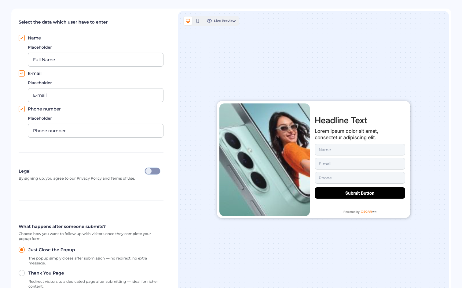
The rule: fewer fields, more conversions. Name and email cover most cases. Add phone only if you'll use it — for example, for WhatsApp follow-ups. Each field gets a custom placeholder ("Full Name", "E-mail"), so the form speaks your visitors' language.
Don't skip the Legal toggle: it adds the privacy-policy consent line under the form. Required in the EU, good practice everywhere.
Important: resist the urge to collect "just in case" data. Company, role, budget — every extra field measurably drops conversion. Capture the minimum now; enrich later.
Step 2. Decide what happens after submit
This is the step most people leave on default — and it's where the experience is won or lost. Under Forms → "What happens after someone submits?", you get three options:
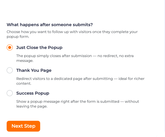
Just close the popup. The form disappears — no redirect, no message. Use it when the value was already delivered (e.g., the discount code was shown on the form itself). Clean and quiet.
Thank You page. Redirects to a dedicated page after submitting. Best when you want to continue the journey — show related products, embed a video, or present the next offer.
Success popup. Shows a confirmation message right there, without leaving the page. This is the sweet spot for most lead forms: the visitor gets instant confirmation and stays where they were:
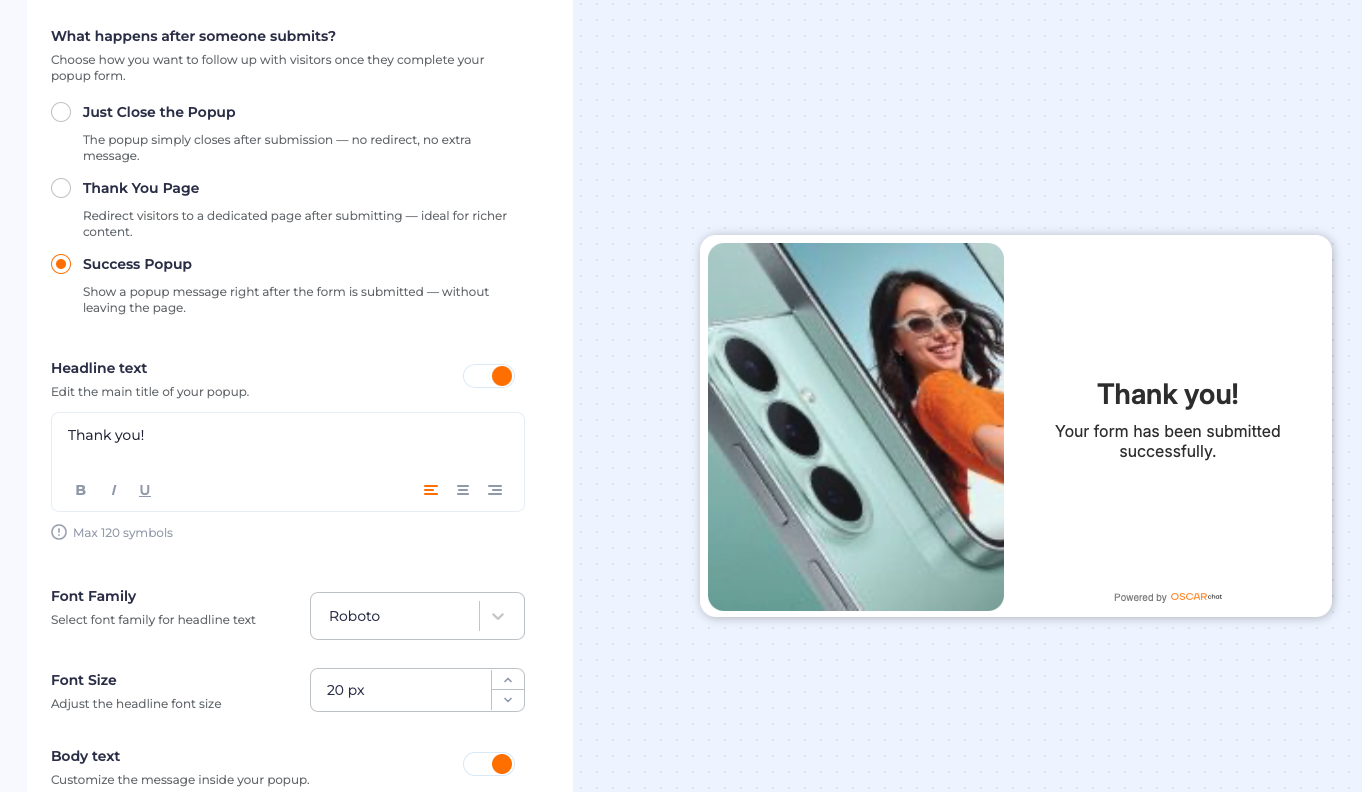
The rule: match the follow-up to the promise. If the popup offered a discount code, the success message should deliver it immediately. Never make a visitor check their email for something you could show right now.
Step 3. Make it look like your brand
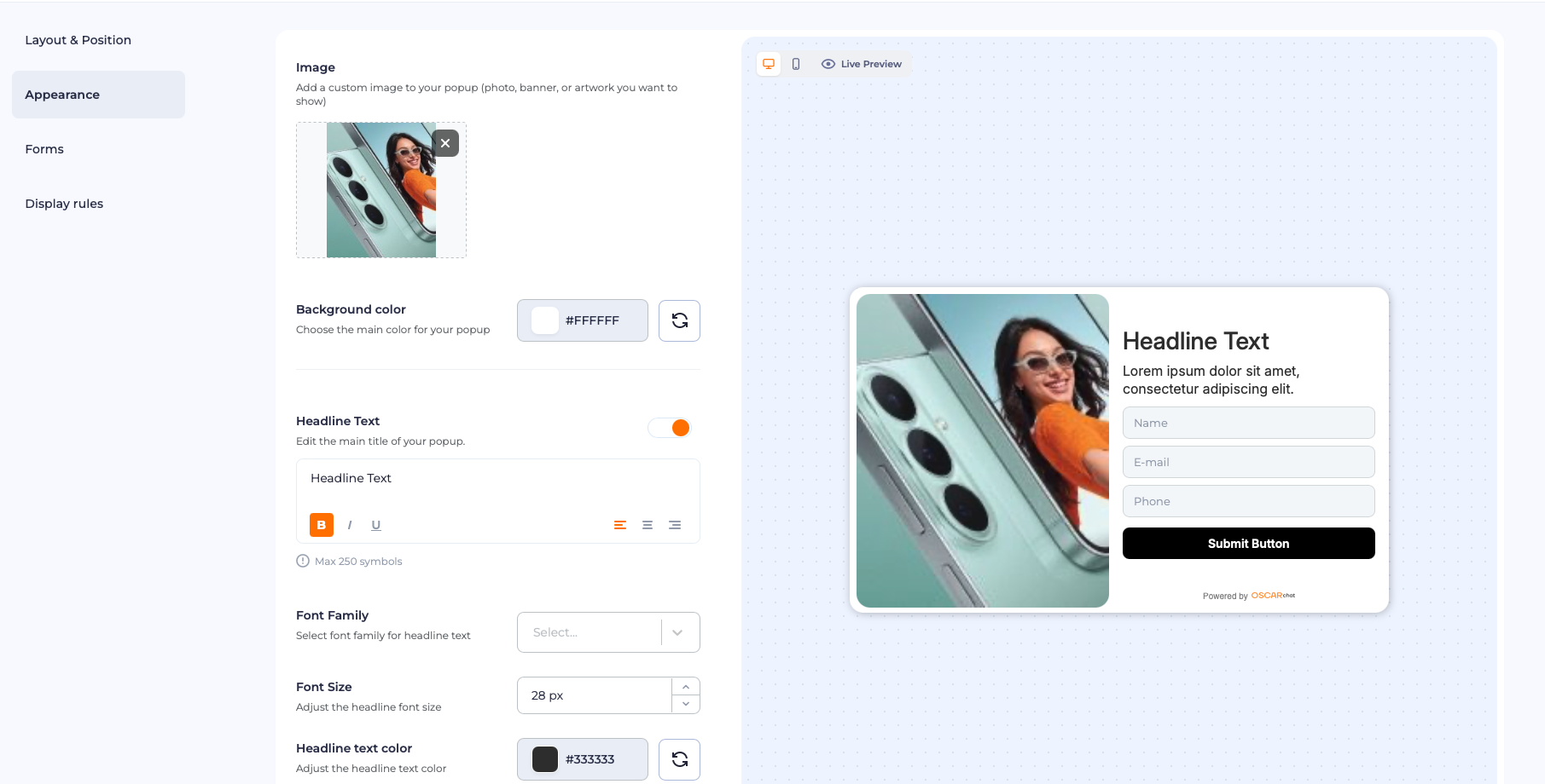
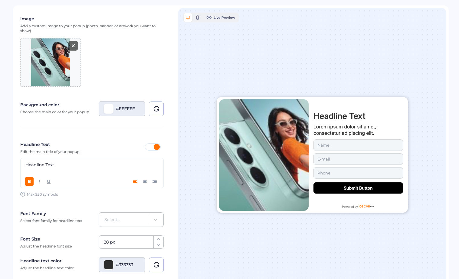
Under Appearance, everything visual lives in one place: the popup image, background color, headline text, font family, and font size — each with a live preview:
A few guidelines that matter more than they seem:
- Use real product photography, not abstract graphics. The popup should remind visitors what they're shopping for.
- The headline is the offer, not the greeting. "Get 10% off your first order" beats "Welcome!" — the visitor should understand the trade in one glance.
- One button, one action. The button text should describe the reward ("Get discount"), not the chore ("Submit").
Step 4. Set the display rules
This is the most important tab — and the one that answers "how do I make popups useful instead of annoying?" Open Display rules in the left panel, then set your triggers — the behavioral conditions from the builder:
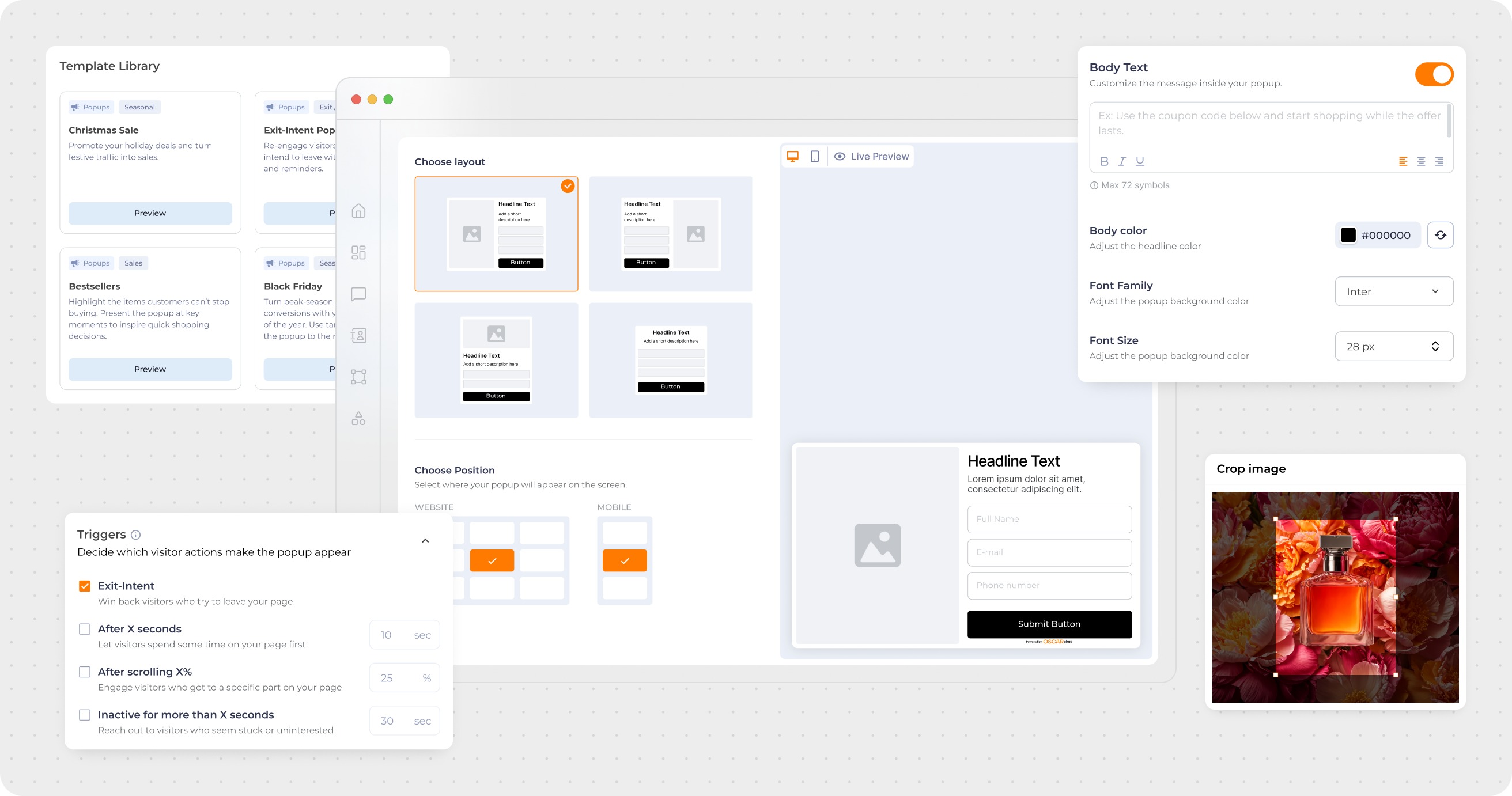
The four triggers, and when to use each:
- Exit-intent — the visitor is leaving. Last chance: offer the discount code. Highest-converting trigger in ecommerce.
- After X seconds — the visitor is engaged (30 seconds on a product page signals real interest). Reward attention, don't ambush it.
- After scrolling X% — the visitor consumed your content. A content upgrade or related offer feels like a next step.
- Inactive for X seconds — the visitor is stuck or distracted. A gentle "need help?" nudge can save the sale.
And the rules behind the rules:
- Frequency cap: once per visitor per visit. Showing the same popup twice trains people to close it on reflex.
- Page targeting: product pages get cart-savers, blog pages get content upgrades. Not every page deserves a popup.
- Mobile gets separate logic: there's no mouse-exit on phones — use scroll and time triggers, and keep the design thumb-friendly.
Test before you launch
Use the Live Preview toggle (desktop and mobile views) to check every state: the form, the success message, and the mobile layout. Submit a test entry yourself. If anything feels abrupt or confusing, your visitors will feel it ten times more.
7-Day Pro Trial for Every New Account
For your first 7 days, you are automatically on the Pro plan.
FAQ
-
Where do I find display rules in Oscar Chat?
In the popup builder's left panel — the Display rules tab, next to Appearance and Forms. That's where triggers, frequency, and targeting live. -
Which trigger should I start with?
Exit-intent with a 10–15% discount. It's the simplest to understand, the easiest to measure, and the highest-converting for most stores. -
What should happen after someone submits my form?
In most cases, a Success popup delivering the promised value immediately (the discount code, the confirmation). Use a Thank You page when you want to continue the journey with more content or offers. -
How many form fields is too many?
More than three is too many for a popup. Name and email cover nearly every use case; add phone only with a concrete plan to use it. -
Can I use different popups on different pages?
Yes — and you should. Page-level targeting is what makes popups feel relevant instead of random. Set it up under Display rules. -
Do these rules work for Black Friday traffic?
They're built for it. Seasonal templates plus exit-intent discount codes are exactly the combination high-traffic weeks need — see our Black Friday playbook.