
Quick recommendation
Start with a compact lower-right widget on desktop, audit every mobile page for sticky element conflicts, and add stronger inline chat prompts on product, pricing, booking, and checkout pages where visitors are already close to action.
What Good Placement Actually Does
Good placement does three things. First, it makes help easy to find. Second, it keeps the primary page action clear. Third, it matches the visitor’s intent at that moment.
If the goal is real-time help, design the bubble as part of the live chat for websites experience: visible enough to invite a question, but never on top of the button the visitor came to click.
A chat widget on a pricing page should help people choose a plan. A widget on a product page should answer fit, delivery, returns, and comparison questions. A widget on a support article should help the visitor solve the issue or reach a person if the answer is not enough.
The Best Default Position
For most desktop websites, the lower-right corner is the safest starting point. Visitors recognize it, it is easy to scan, and it usually avoids the main navigation. But default does not mean final.
Placement by Page Type
Product pages
Keep chat near the buying path, but never over size selectors, add-to-cart buttons, variant pickers, or delivery details.
Pricing pages
Use a stronger prompt such as “Need help choosing a plan?” because pricing visitors are already comparing options.
Checkout pages
Make chat available for blockers, but keep it compact and away from payment fields and sticky checkout controls.
Blog and SEO pages
Use a softer lead-capture prompt after the visitor has had time to read and understand the topic.
Mobile Rules: Smaller Screen, Higher Stakes
Mobile is where chat placement breaks most often. A bubble that looks fine on desktop can cover the only button the visitor needs on mobile. Before publishing, test the widget on real product pages, checkout flows, forms, and cookie banners.
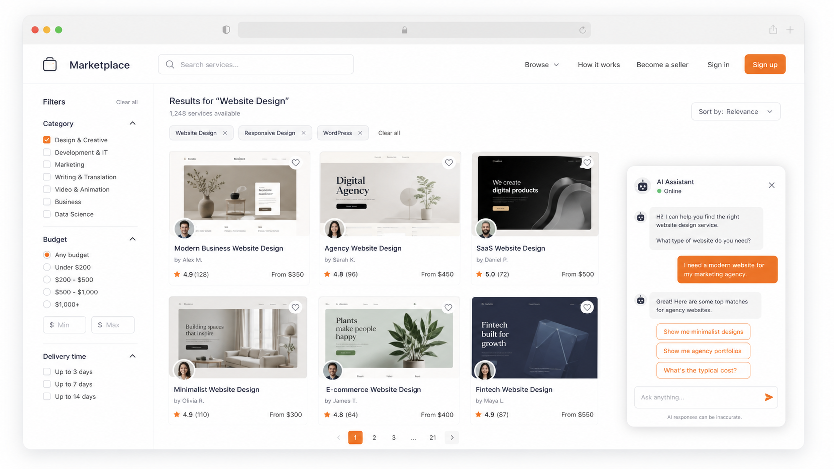
How to Set It Up in Oscar Chat
The best way to avoid a messy widget is to preview the experience before publishing. Oscar Chat lets you check the assistant identity, theme, preview state, and questions before the widget goes live.
Trigger Rules That Feel Helpful
Placement is not only where the button sits. It is also when the message appears. A widget that opens instantly on every page teaches visitors to close it. A widget that appears after intent is clearer feels useful.
When the same questions repeat across product, pricing, or support pages, placement should also support an AI chatbot that answers before the team needs to step in.
For lead capture moments, connect the prompt to a focused popup builder flow instead of stacking a popup tool, a form tool, and a chat tool that do not share context.
Accessibility and UX Checklist
- The button has clear contrast against the page background.
- The open and close controls are easy to tap on mobile.
- The widget does not trap keyboard focus.
- The widget does not hide core page content when zoomed.
- The chat label is understandable for screen reader users.
- Proactive messages can be dismissed without fighting the interface.
Metrics That Matter
A Simple Placement Playbook
- Start lower-right on desktop and compact on mobile.
- Audit sticky elements before publishing.
- Use page-specific prompts instead of one generic greeting.
- Add inline chat CTAs on pricing, product, and booking sections.
- Use delayed triggers instead of instant interruption.
- Review transcripts and adjust placement by intent. If the widget starts collecting contact details, use the same low-friction logic from the pre-chat form best practices guide.
The real win is not the bubble position.
The win is matching the chat entry point to what the visitor is trying to do. Oscar Chat helps because chat, forms, popups, and click-to-chat buttons can work together instead of forcing every visitor into one generic chat bubble.
Frequently Asked Questions
Where should a chat widget be placed on a website?
The lower-right corner is the safest default for most desktop websites because visitors expect chat there and it rarely blocks navigation. Still, placement should be tested by page type.
Should a chat widget appear on every page?
Not always. Start with high-intent pages such as product, pricing, checkout, booking, contact, and service pages. Expand when the data shows that chat helps.
Can chat widget placement hurt conversions?
Yes. If the widget covers checkout buttons, sticky bars, product selectors, cookie notices, or mobile navigation, it can create friction and reduce conversions.
What is the best mobile chat widget placement?
Use a compact button near the lower edge, but keep it away from sticky add-to-cart buttons, cookie controls, and bottom navigation. Test the full mobile journey.
Should chat open automatically?
Usually no. Use delayed or intent-based prompts instead of opening immediately on every page. The best trigger depends on the page and visitor behavior.
How do you test chat widget placement?
Track widget opens, conversation starts, qualified leads, conversion after chat, mobile conflicts, and rage clicks. Compare results by page type.
Which pages benefit most from chat widgets?
Pricing pages, product pages, checkout pages, booking pages, service pages, and FAQ pages usually benefit most because visitors are closer to a decision.
Should I use a chat bubble or an inline chat CTA?
Use a bubble as the default entry point and add inline chat CTAs on high-intent sections where visitors may need help choosing or buying.
How can Oscar Chat help with placement?
Oscar Chat gives teams chat, popups, forms, and click-to-chat entry points, so each page can use the prompt that matches visitor intent.
What is the biggest chat widget placement mistake?
The biggest mistake is using the same widget behavior on every page instead of adapting prompts, timing, and placement to the visitor journey.